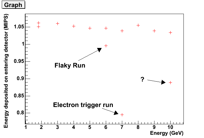
There are a few odd points along the way, but the trend seems to slope the wrong way...
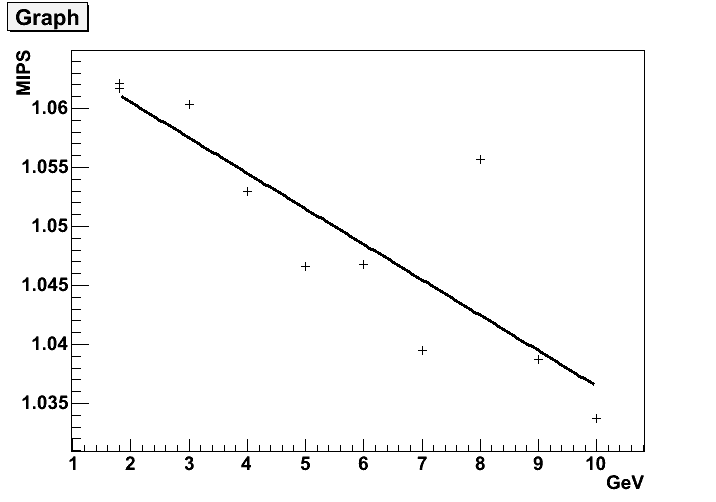
It's clearer by cutting out the strange points...
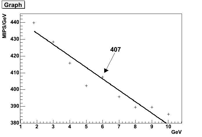
A plot of MIPS/GeV vs Energy appears to show a similar trend... I hadn't noticed this until I plotted it today. So I take an average point, I guess the exact choice is arbitrary...
Then I fix the MIPS/GeV parameter in the code...
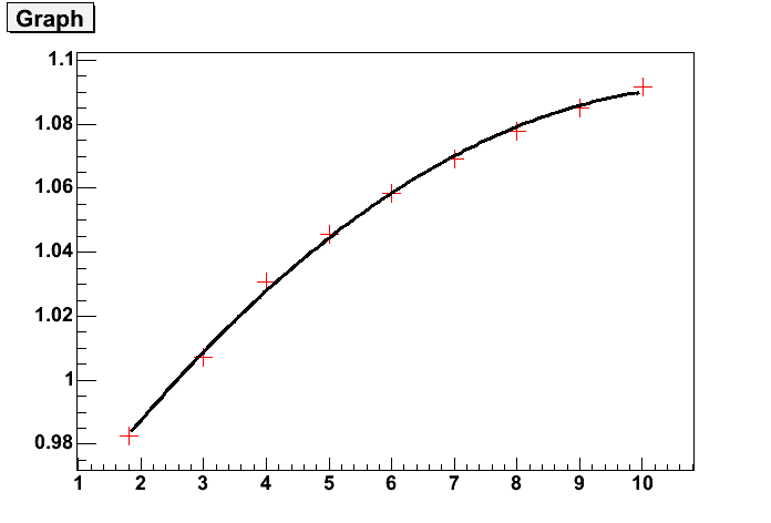
Unbelievably, it comes out rather well.